The theme of the event is "Better City, Better Life" and I assume the pavilions are supposed to represent better ways in which humanity can build and live. What the buildings really mean is what buildings at the World Expo always mean: giant fuck yous to other countries by means of architectural and design splendor. Grandiose signs of architectural hubris? Shouldn't America place pretty well in this contest? You'd think so, but, the results are a quite disappointing.
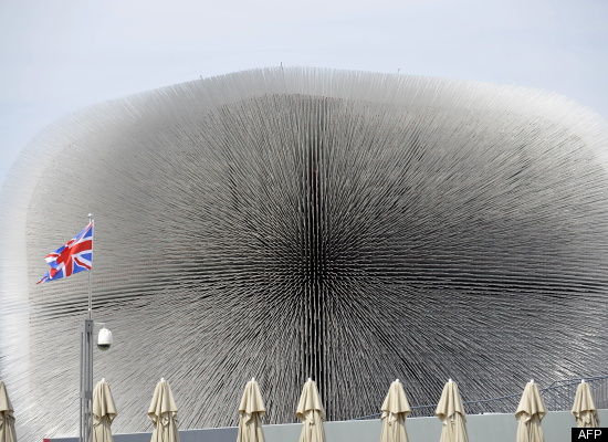
This is the UK's Seed Cathedral by Thomas Heatherwick, which encases a quarter of the world's seeded species from the Millennium Seed Bank inside a transparent acrylic filament.

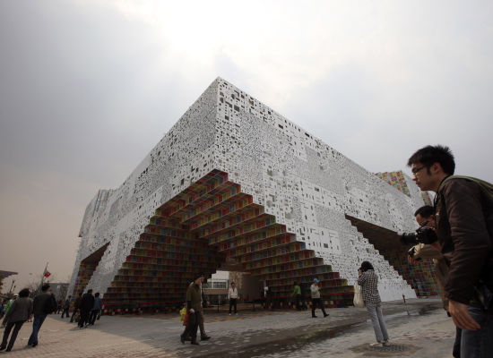
The South Korean pavilion is based around the themes of convergence, symbol, and space as the building comes together to form letters of the Korean alphabet with a relief of letters and colored panels designed by Korean artist Ik-Joong Kang.

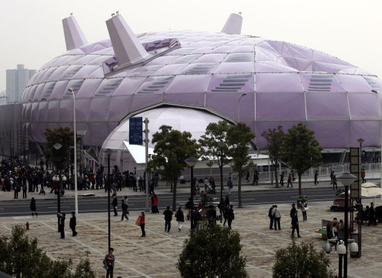
The Japanese Pavilion is nicknamed the Purple Silkworm Island and is meant to showcase themes of connection and incorporate an efficient use of natural resources.

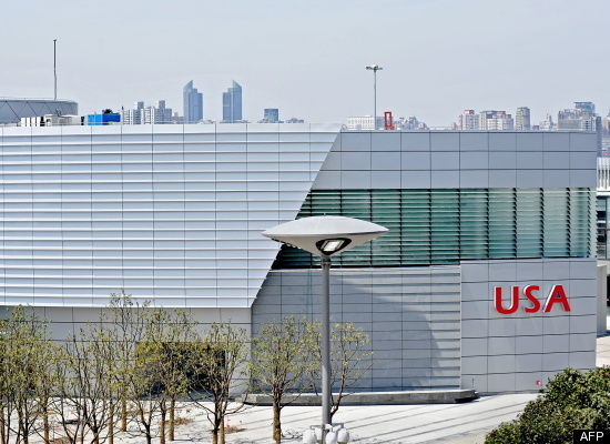
The American Pavilion.... is the shed out back where they store all the cleaning equipment, sawdust for covering up tourist vomit, and spare hot dog carts.

For shame, America. If we can't tell the world to fuck off, architectural style, during an international event celebrating interconnectedness and unity, when can we? May I suggest for the next Expo we just build a large version of this:

Everyone loves The Simpsons and it embodies the whimsical menace I think we want to project. The building could also shoot fireworks and surface to Muslim missiles if the situation calls for it. Call me, we'll talk building and design.


No comments:
Post a Comment