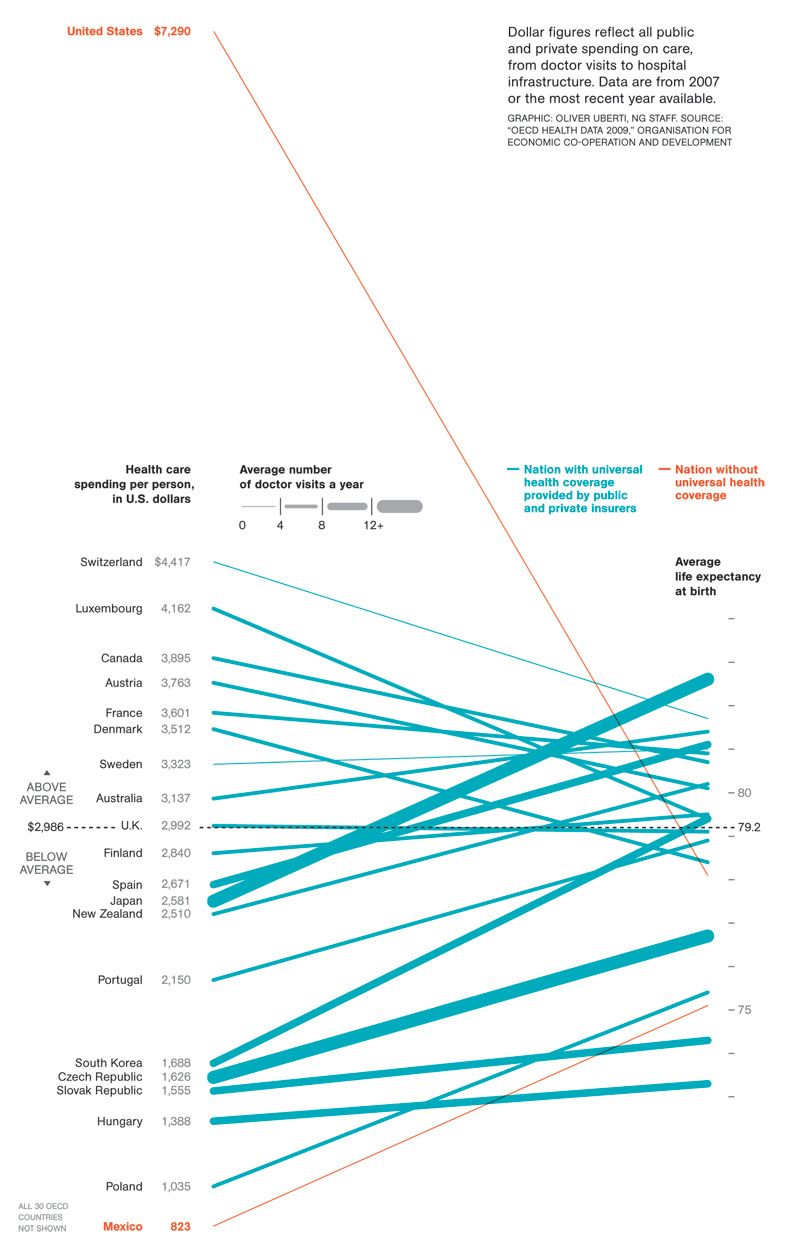
From National Geographic which charts health care costs over time, as well as average life expectancy, doctors visits and who has universal coverage. The conclusion: as always, we're getting pounded in the ass by costs and for little actual benefit.
The revelation is just how staggering the disparity is. But then again, socialism blah blah socialism blah bad socialism freedom blah blah America. Meanwhile the extremely contentious and minimally incremental action we are going to take is only going to combat this by a little bit.
Ah well, I'm sure plugging our fingers in our ears when anyone tries to point this out while yelling "AMERICAN HEALTH CARE IS THE BEST! AMERICAN HEALTH CARE IS THE BEST!" is almost as good as not paying twice what everyone else pays for worse coverage. That seems to be the conclusion our elected betters came to and who are we to disagree?


No comments:
Post a Comment