Showing posts with label design. Show all posts

Tuesday, April 27, 2010

Compare/Contrast

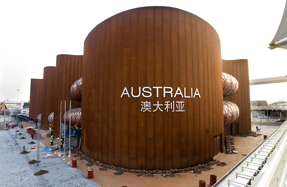
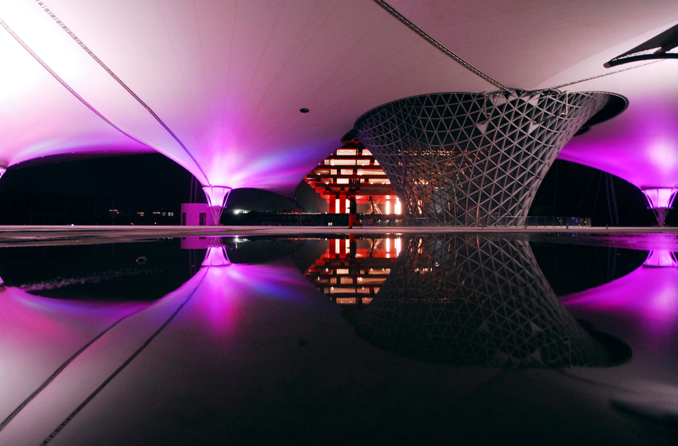
The 2010 World Expo in Shanghai is upon us. Since the last time we covered it, construction has been completed on the various country pavilions in preparation for the May 1st opening.

The theme of the event is "Better City, Better Life" and I assume the pavilions are supposed to represent better ways in which humanity can build and live. What the buildings really mean is what buildings at the World Expo always mean: giant fuck yous to other countries by means of architectural and design splendor. Grandiose signs of architectural hubris? Shouldn't America place pretty well in this contest? You'd think so, but, the results are a quite disappointing.

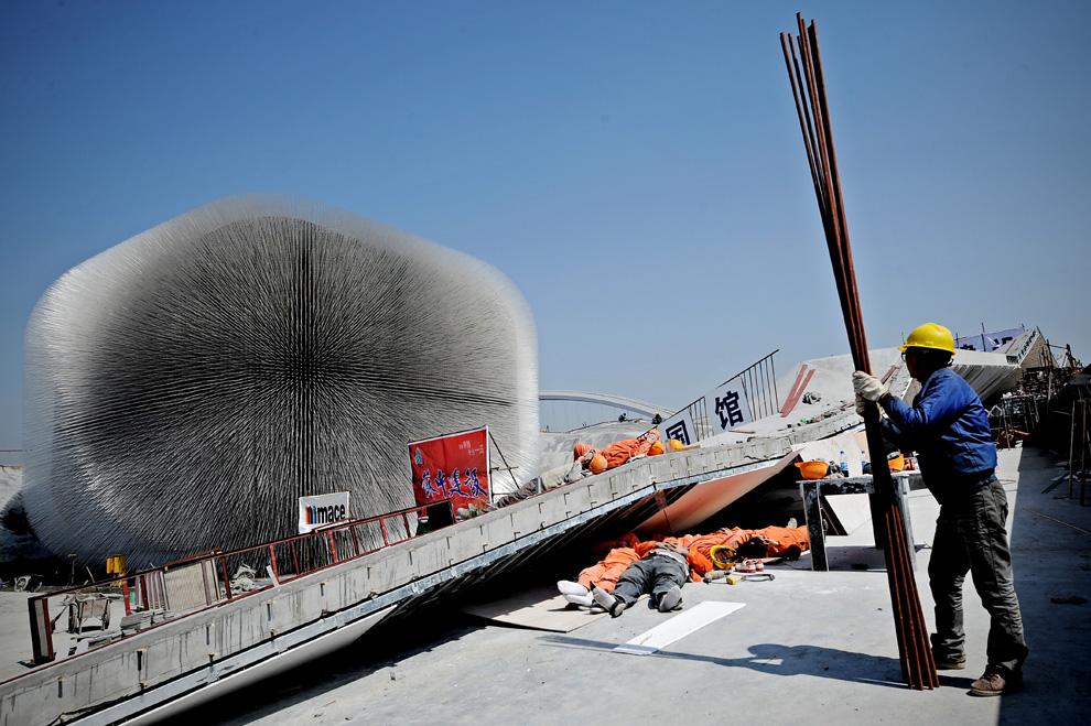
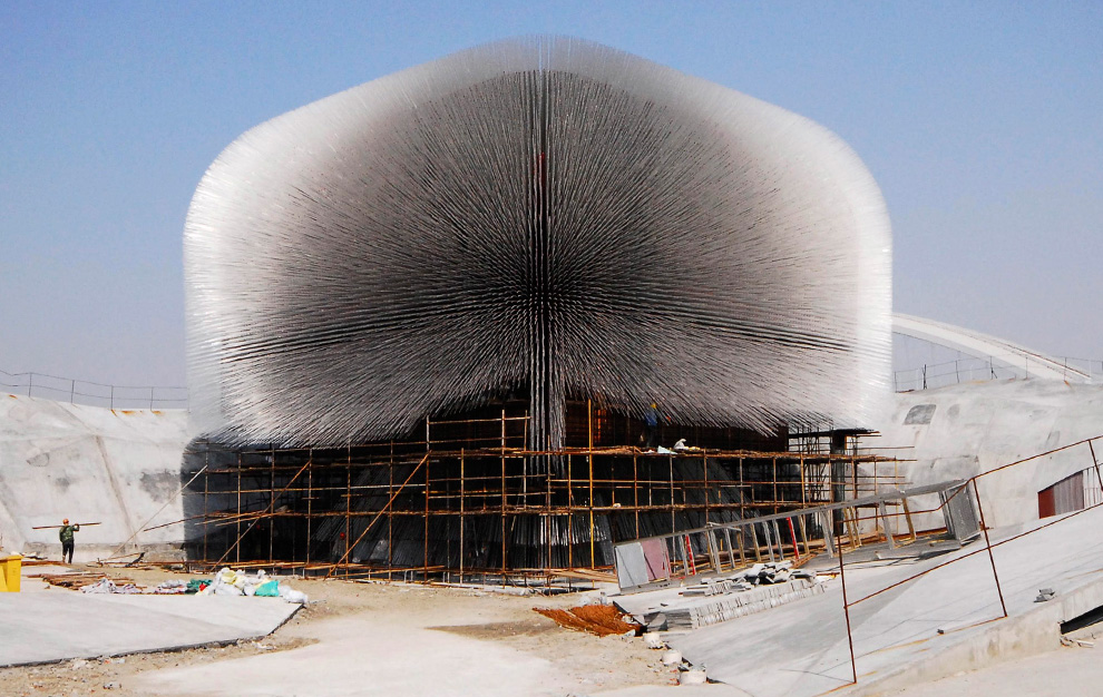
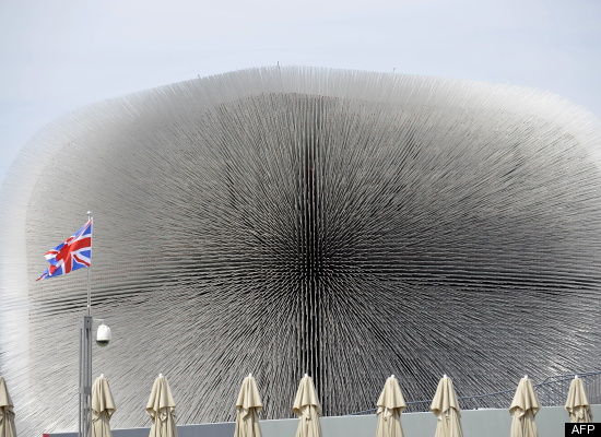
This is the UK's Seed Cathedral by Thomas Heatherwick, which encases a quarter of the world's seeded species from the Millennium Seed Bank inside a transparent acrylic filament.

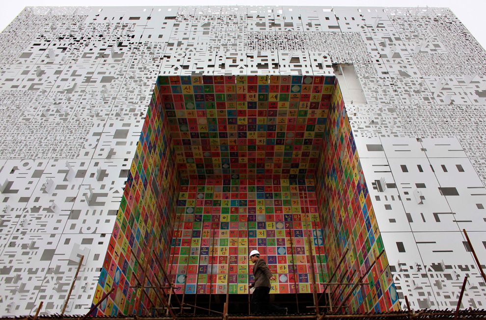
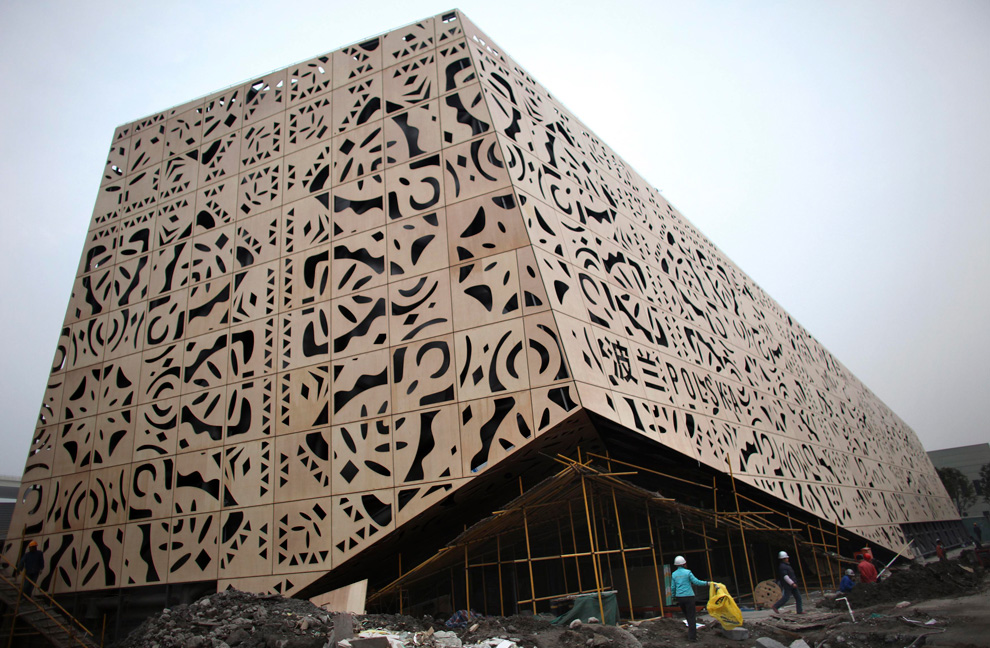
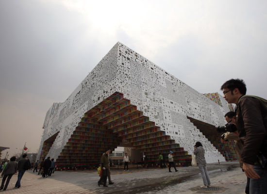
The South Korean pavilion is based around the themes of convergence, symbol, and space as the building comes together to form letters of the Korean alphabet with a relief of letters and colored panels designed by Korean artist Ik-Joong Kang.

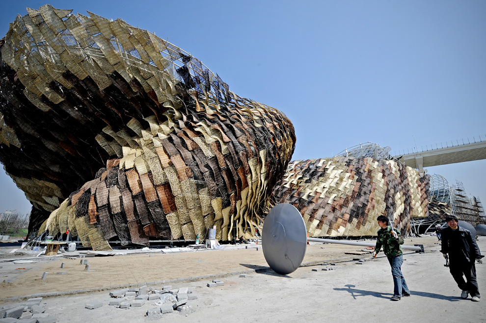
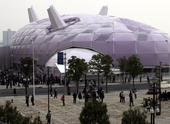
The Japanese Pavilion is nicknamed the Purple Silkworm Island and is meant to showcase themes of connection and incorporate an efficient use of natural resources.

The American Pavilion.... is the shed out back where they store all the cleaning equipment, sawdust for covering up tourist vomit, and spare hot dog carts.
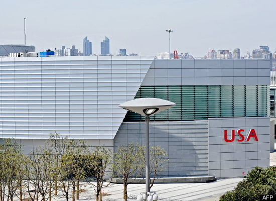

For shame, America. If we can't tell the world to fuck off, architectural style, during an international event celebrating interconnectedness and unity, when can we? May I suggest for the next Expo we just build a large version of this:
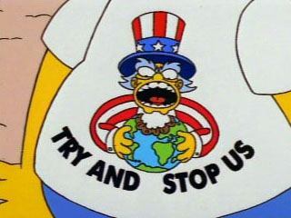

Everyone loves The Simpsons and it embodies the whimsical menace I think we want to project. The building could also shoot fireworks and surface to Muslim missiles if the situation calls for it. Call me, we'll talk building and design.

Thursday, April 15, 2010

Muslimification

The Daily Show on how the Obama Administration may or may not be sending coded message to its Muslim brethren through summit logo designs and how Fox News is either SS or kamikaze sympathizers. Also, as a bonus: John Oliver converts weights from metric to Americanese.


That's convincing and all, but we've already seen how Obama morphed a missile defense logo into a combo Muslim crescent/Obama campaign logo signaling that this country would soon be under Shariah Law, what's to stop us from baselessly thinking this is all also Muslim conspiracy related? I mean, have you seen this?


What about this?

Do I need to put you in a burka and then honor kill you or are you starting to get it yet? OBAMA IS SENDING MESSAGES OF IMMINENT ISLAMIC OVERTHROW THROUGH THE LOGO DESIGNS OF MINOR GOVERNMENT AGENCIES AND SUMMIT MEETINGS! It's so obvious!

Look, when we're all praying five times a day towards Mecca and flying our own planes into our own buildings to teach us a lesson, don't say I didn't give you clear warnings that it was going to happen. It was in the logos!

Wednesday, March 31, 2010

I'm sure this won't result in some sort of rash of falling deaths


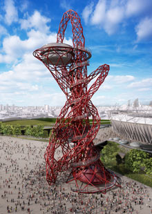
Maybe some of you readers have been to Paris. Tell me, wasn't the first thing you thought when you saw the Eiffel Tower "Boy, I sure wish this durned thing was red and twisty and that any idiot with a sixpack of Natural Ice in him could climb up it if he or she wished to"? Sure, we all say that. The lack of a climable metal piece of artwork is Paris' greatest flaw. Plus, it would be better if Eiffel also built it in a place that spoke English; either the King's or Americanese.

Well London, the UK Olympic Committee, London mayor Boris Johnson, and architect Anish Kapoor heard your clarion call. Climbable red twisty Eiffel Tower!
Designs for what will be Britain's biggest piece of public art, a 120 metres tall looping tower by the artist Anish Kapoor that people will be able to climb, giving spectacular views of London, were unveiled today by Boris Johnson, mayor of London.

Kapoor's Orbit, a vast, snaking steel structure, will dominate the 2012 Olympic park. It is being hailed as London's answer to the Eiffel tower and is part of an ambition to make the Olympics site a permanent visitor attraction.

Kapoor won the commission from a shortlist of bidders believed to include the artist Antony Gormley and the architects Caruso St John. Johnson said of Kapoor: "He has taken the idea of a tower and transformed it into a piece of modern British art. It would have boggled the minds of the Romans. It would have boggled Gustave Eiffel."
Hmm, I think you're overselling it a bit, Boris. Still one does appreciate the verve with which you're opening up English citizens and tourists from all around the world to violent falling deaths from a distance of up to 120 meters. Truly your commitment to the Olympic tradition of building immensely ludicrous structures is not constrained by base notions of architectural eyesores and public safety. Well done, sirs.

Tuesday, March 16, 2010

Picture of the day

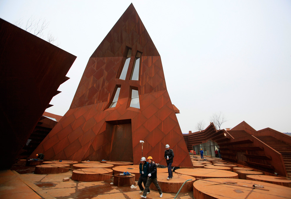
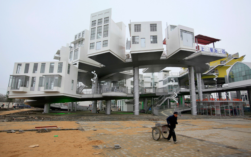
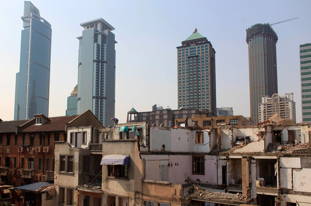
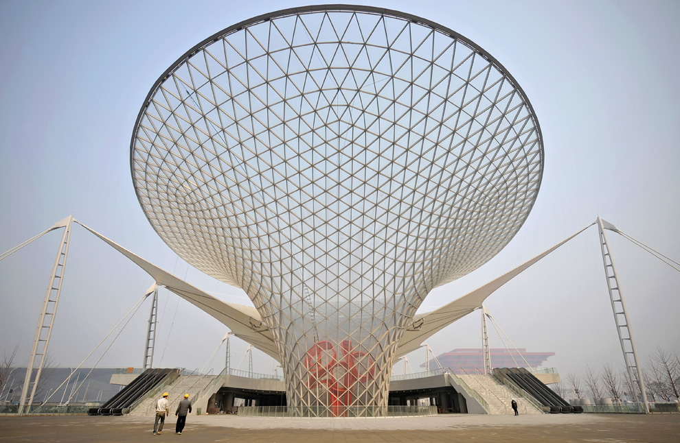
The 2010 World Expo is almost upon us. "Already?" you're asking? Yes, already. I know, it seems like we were just celebrating the last World Expo whenever and wherever that was and now this one has crept up on us. The 2010 Expo is taking place in Shanghai, China, so we all know what that means: ludicrous buildings that will immediately become uninhabited forever once the expo ends! Soon they will have more empty, unused architectural masterpieces than citizens. It is China's way.

The Big Picture blog is cataloging this latest folly, showing that while this event won't benefit the people of China in anyway, it will at least provide them with an interesting few months of Expo-ing and some nice abandoned shelters for the homeless to huddle in once the event is over.

There are a lot of nonsensical structures, so we had to add in a jump. As always embiggening is enabled by clicking.


Thursday, March 11, 2010

Your silly little country, explained

The next time someone asks you to explain American politics, we strongly suggest you direct them to the image below, a beautiful infographic created by Stefanie Posavec and David McCandless. Click the image to properly embiggen and, hopefully, enlighten.

Thursday, February 25, 2010

Evidence of the Muslim conspiracy


What's this, you say? Some would claim it's just the new logo redesign for the US Missile Defense Agency juxtaposed next to the old logo. Most people would be fine with that because ROCKETS BOOM KAPOW PEWPEWPEW WHOOSH BOOOM!

But others, namely Frank Gaffney, see it as something far more nefarious, something far more insidious, and something that gravely endangers America... as we know it.
A just-unveiled symbolic action suggests, however, that something even more nefarious is afoot… Team Obama’s anti-anti-missile initiatives are not simply acts of unilateral disarmament of the sort to be expected from an Alinsky acolyte. They seem to fit an increasingly obvious and worrying pattern of official U.S. submission to Islam and the theo-political-legal program the latter’s authorities call Shariah… the new MDA shield appears ominously to reflect a morphing of the Islamic crescent and star with the Obama campaign logo… Watch this space as we identify and consider various, ominous and far more clear-cut acts of submission to Shariah by President Obama and his team.
Well, obviously.

It must be of crushing disappointment to Obama to see his plans for US Shariah exposed so quickly. He's spent all these past decades forging his own birth certificate, hiding his Muslim heritage, infiltrating himself into American society, amassing power, and then tricking the masses so that he might control our government. He must be heartbroken that it's all going to come crashing down just because he decided to explicitly explain his plans for the Muslim overthrow of our country in a logo redesign.

You tripped up, Obama. We're on to you and there's nothing you can do to silence us. No Shariah in the US!

Wednesday, January 6, 2010

Picture of the day

Part of a Time Magazine photo essay on the largest middle finger in human history and the biggest possible "fuck you" that one country could possibly give during a global recession, the newly rechristened Burj Khalifa, named after light hitting mid-eighties Pirates shortstop Sammy Khalifa.

If you're up for reading some more about the Burj, try the La Times article called A Temple to Hubris or this BBC article detailing the inhumane conditions it took to build the Burj and most of Dubai. It just shows what you can do when you dare to dream... and dare to spend way beyond your means... and dare to employ slave labor.


Wednesday, December 30, 2009

Art of the day

From Bibliodyssey and the people of Nuclear Engineering International, comes this graphical reproductions of nuclear reactors built in the seventies and early eighties. You know, just in case you ever get caught in Daya Bay Nuclear Power Plant in Guangdong and not only need to what the condenser tube material is made of (titanium), but also need to know whether the in-core instrumentation room is next to the safety injection accumulator (it is). It happens to me all the fucking time.

Click to really, really embiggen.


Tuesday, December 15, 2009

Today in design


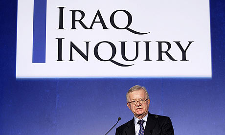
What is that? It's Sir John Chilcot standing in front of a nicely designed and official looking sign for the UK's Iraq Inquiry, the British Government's official attempt to find out what the fuck happened to drag the UK into our ill advised war. Serifs and a fancy 'Q' tail? Is that the ubiquitous movie poster favorite Trajan font? England you do know how to investigate a foreign policy disaster with style.

Will we have a nicely designed sign for our Iraq Inquiry? No, we aren't even going to have an inquiry, let alone a sign. No, looking into the run-up to Iraq would be "focusing on the past" and we have to many things in the future to look towards. Namely, not having an Afghanistan Escalation Inquiry.

Friday, December 11, 2009

Who's hungry?

From designers Publicis Mojo and CALM, the New Zealand Campaign Against Landmines, comes a new way to educate about landmines: ketchup packets.
Using a ketchup sachet, we demonstrated the horrific nature of living in a land mine affected country and how much a part of everyday life that horror is. The idea is simple: as you tear open the sachet you also rip through the child’s leg and the ketchup inside pours out like blood.
Wonderful. Now I am politically aware about the important issue of landmines, landmine removal, and landmine safety... and I never want to eat ketchup again. Win-win.

At press time These Bastards is still trying to confirm if this program was also underwritten by the Gulden's mustard consortium. We're through the looking glass, people.

Friday, October 16, 2009

Picture of the Day

Click to embiggen


via National Geographic comes a look at the last 52 years of space exploration by our planet (read: the US and the commies) in a giant and graphically awesome way. Click the first picture to see a massive version and go to the NG site to see an interactive version of the chart.

Wednesday, October 14, 2009

Toilet-shaped residence-based activism of the day

Above is the porcelain throne-based house designed by Korean activist Sim Jae-duck. This 4,500-sq-foot residence is meant to be a monument to the South Korean people's impeccable hygiene, as well as a rallying cry on the part of the World Toilet Association -- Mr. Jae-duck is President of the fledgling organization -- which was founded on a commitment to "improving toilet and sanitation conditions worldwide."

We're all for calling attention to sanitation conditions, especially in developing nations, but what's going to happen when Kim Jong Il gets a look at this and orders one built next to his water slide?

Monday, October 12, 2009

Design of the day


via Ecofriend comes this look at Graft Lab's Vertical Village, the next salvo in Dubai's attempt to transform itself into a Final Fantasy video game. The building is for, what else, hotel and entertainment facilities with some residential mixed in. Presumably for those that come to visit and work there short term and not for the dozen people who are actually from Dubai. People from Dubai live in London. The project will receive LEED Gold Star certification, which is expected considering it is a giant solar panel that people can party in.

Unconfirmed reports have it stealing all of the earth's sunlight via it's massive massive solar collectors. Be forewarned: we will have to go to Dubai to visit warmth and light now. On the bright side, they do have ample hotel space for us all.

Thursday, June 11, 2009

Ads of the day: Buy Heroin!


Reading about the news today that battle lines are being drawn in the health care debate (AMA: "People who want a public plan can eat a bag of hell", Experts: "Go intercourse yourself AMA!", AMA: "You know, on second thought...") I happened to stumble across the good people at Pill Talk, who put together a nice little collection of old pharmaceutical ads. Heroin! Chlorophyll! Cocaine! Cigarettes! Snake Oil!

Oh for the days when Big Pharma would totally try to get you gooned up on highly addictive opiates through a series of lies, half-truths, and fear mongering about imaginary diseases that they made up. So glad they aren't allowed to do that anymore.

Monday, June 8, 2009

Salute your new flag


Above is the new flag of Earth as decided upon by the North America Astrophysical Observatory, who are also apparently in charge of planetary flag design.

Meh.

First off, I would like to commend them for not using the design we all know they wanted to use. Secondly, we commend the prominent use of black and gold, despite the fact your white circle symbolizing the moon has a distinct lack of three multi-colored hypocycloids. Black and gold are good enough for a city of champions, they are good enough for the only planet that matters.

If there is one quibble, it's the prominent use of blue which throws the design off. I know, I know: earth, water, sky, blue, blah blah blah. But one wants to present the colors of pride and victory befitting the people of earth, one does not immediately rush to think of the Denver Nuggets and San Diego Chargers. Maybe less circles as well. We are a jabby stabby pointy people and we need triangles and other edged weapon-like shapes to represent us.

Still, good first effort. We just need a flag that will either make another civilization think twice about before trying to conquer us with their space armada or will strike fear into the hearts of civilizations that we are trying to conquer with our space armada. Blue circles are not the harbingers of doom.

Thursday, June 4, 2009

Picture of the day


Via the good people at Serious Lunch: Where Conan O'Brien's set builders might have got their set ideas.

Sunday, May 17, 2009

Weekend art


peanut from the "Born With Googly Eyes" series

Partially Eaten Turkey Sandwich on Wheat Award

arguing on a banana phone

Da Vinci's "Spork"


The art, photography, and design of Brock Davis aka Laser Bread

Saturday, February 21, 2009

NEW PENNIES!!!!!!! NEW PENNIES!!!!!!!!!


In a baffling decision, not only did the US Mint decide to keep making pennies, which no one needs and cost more to make than they are worth, but to spruce them up with depictions of Abe Lincoln's life. Pictured are the log cabin he grew up in, reading on a log with his trusty skull bashing mallet at his side, posing for a statue outside the Illinois capitol, and the unfinished US capitol, which was unfinished either because Lincoln destroyed it for laughs or because he was the one who finished building it with his own goddamn bare hands.

The pennies are being put into circulation for Abe's 200th birthday celebration. How about we find another way to honor him, like not making him be on the most useless piece of metal in the US. Maybe have him with his arm around Sacajawea and flashing the peace sign on the dollar coin, or giving Franklin a noogie on the $100, or maybe put two Lincoln's on the five, high fiving. Maybe the second Lincoln is copper colored and they're high fiving because he's finally moved on up off of the penny, I'll let the Mint figure that one out.

Monday, December 15, 2008

The design paths not taken

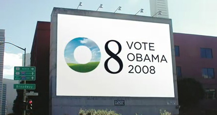
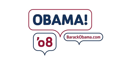
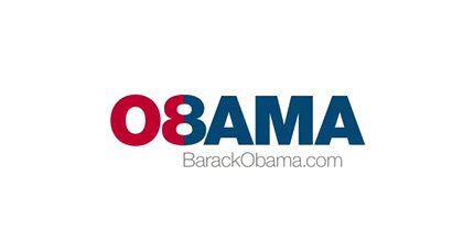
Sol Sender, who led a design team for the ubiquitous Obama 08 sunrise logo and font scheme, was recently interviewed about the design project and offered up some of the rejected designs for the campaign. Honestly, would you have voted for a man trying to turn a zero and eight into an O and a B, let alone a guy using word bubbles as a logo? I think not, McCain/Palin and their militaristic star all the way!